



Branding built on what you stand for

This guided branding journey is for creatives, performers, and small to medium-sized businesses doing great work but not being noticed. I help them find what they want to say and say it with conviction.

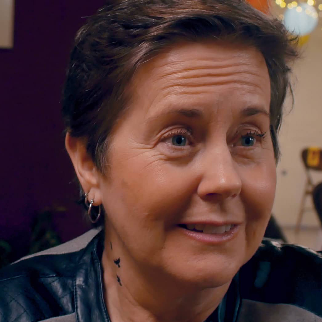
Rommel is kind, perceptive, incredibly articulate and working with him on my personal brand focused my message as I spoke on podcasts and in interviews during the release of my book and audiobook Bachelorx. I recommend him highly. He goes above and beyond.
Skye Lyralen Kaye
Award-winning Author & Actor

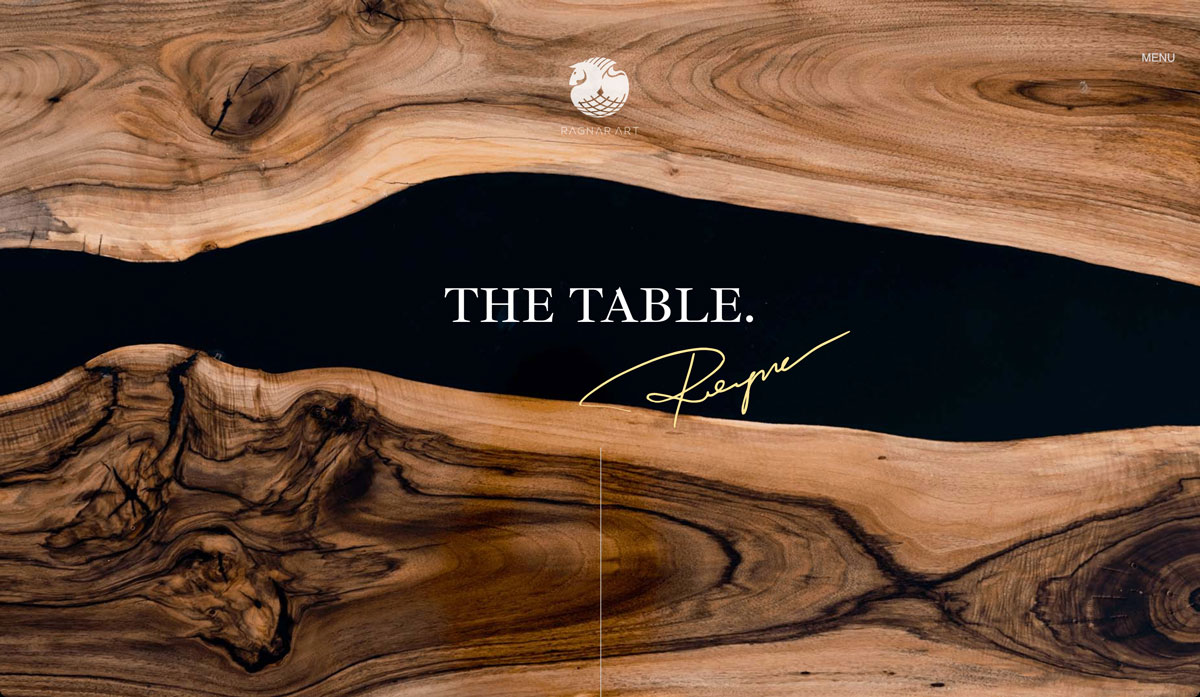
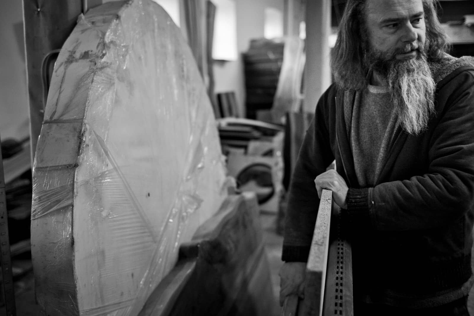
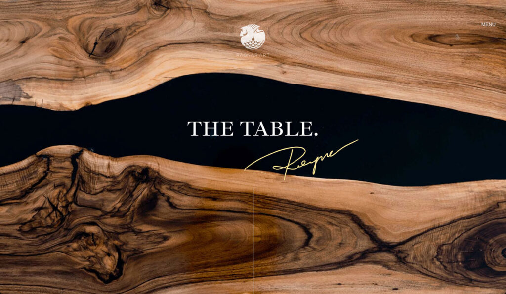
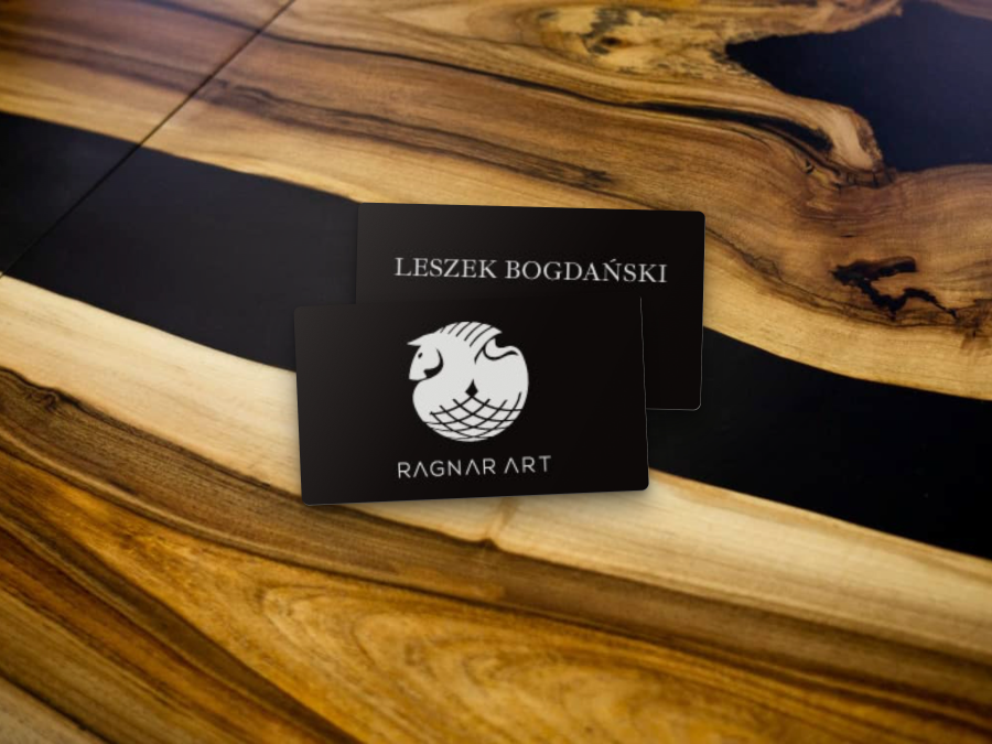
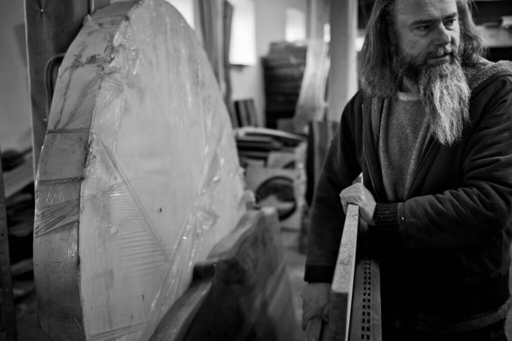
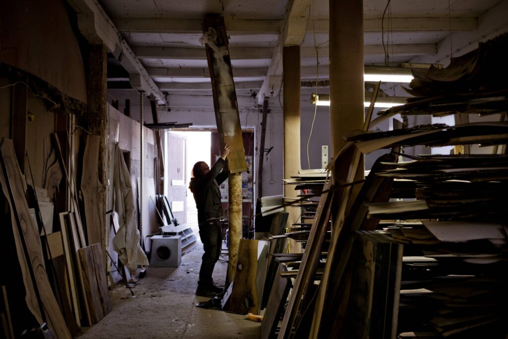
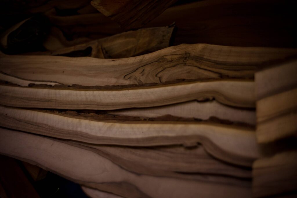
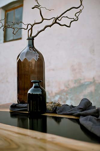
Working for Leszek B. - Ragnar, the man himself, was one solid adventure. He had been crafting these tables from exquisite walnut. Dark rivers of epoxy resin ran between them. The beautiful thing is, Leszek figured out how to make the whole table lightweight, his own patent. The result is stunning.

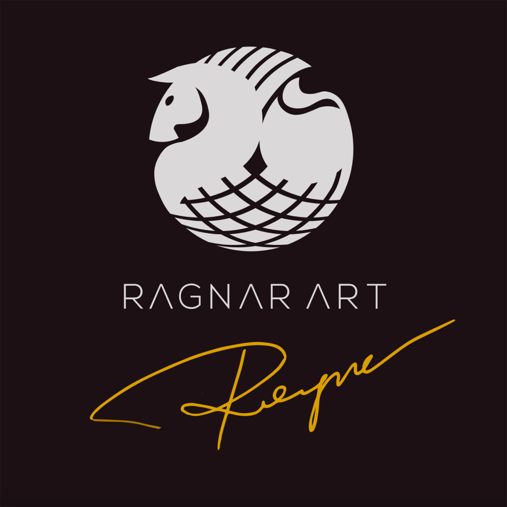
The difficulty he was facing was bringing everything together into a consistent story. Although the brand would be Ragnar Art, we would make the protagonist “The Table” itself. The centrepiece of dinners, space for art projects, repotting plants, etc. We created a visual language to complement the essence of the Ragnar Art brand: Nature, Human, Ethos, Table. All elements that link through Ragnar Art to The Table.

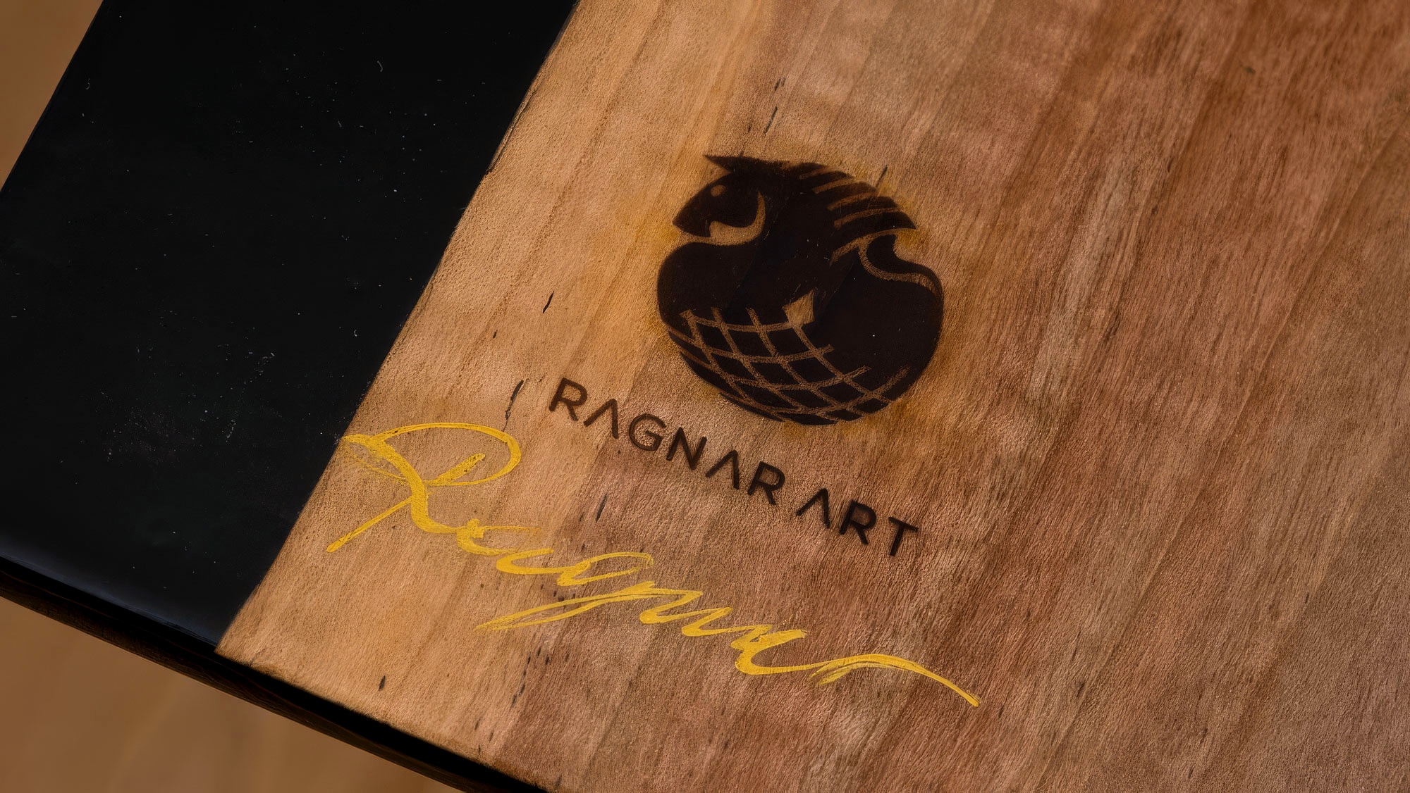
Each table was hand-branded with the Norse-style logo using an iron brand, and then signed in gold by Ragnar himself, each unique and built with care.

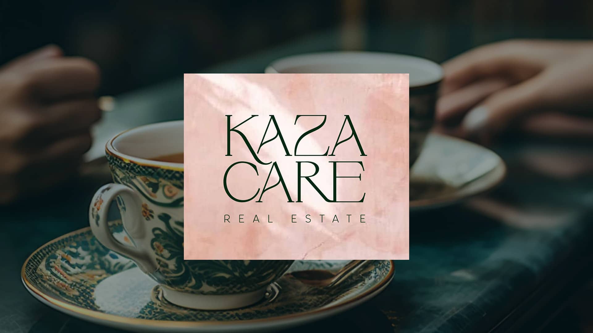
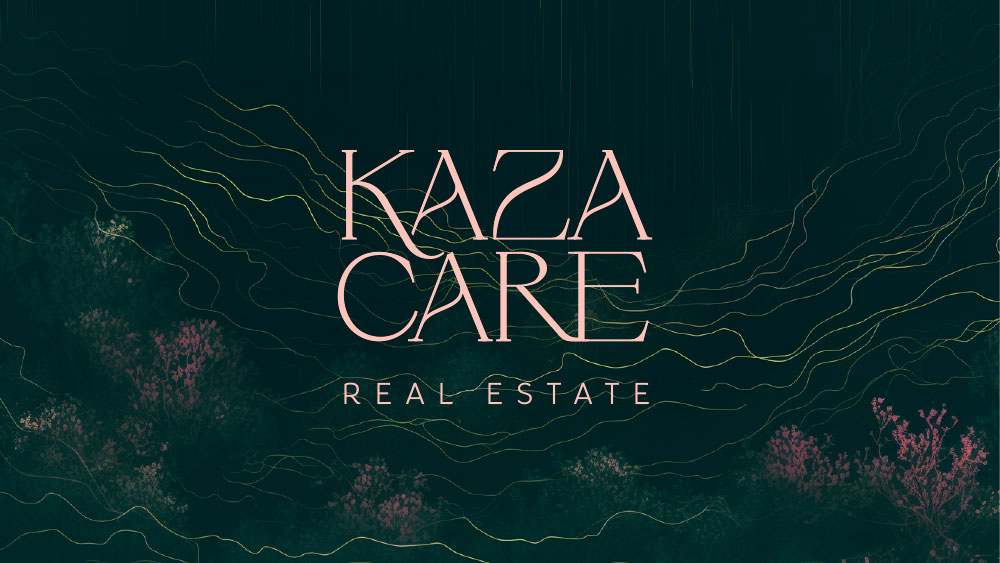
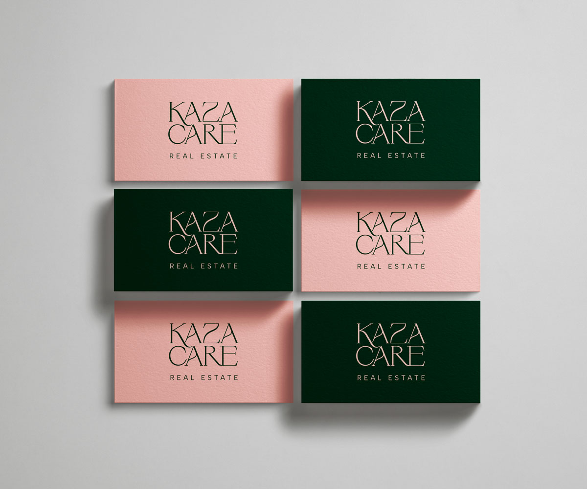
Kazacare is a luxury real estate agency. They've been in the business a good length of time, so they have the experience and a meticulous eye for detail. We wanted to keep Kazacare, the name, but during a few years of neglect, the website was visually and programmatically well out of date. Through the labyrinth of colours we went. Until we fell on a pink I recognised only because I have been/I am in Portugal. It's the Portuguese powder pink of some of the walls of the houses in Lisbon. Paired with a Conifer Green, it dazzles like a chandelier.

This new look and website brought new attention to the business and we were so chuffed at being able to create it.
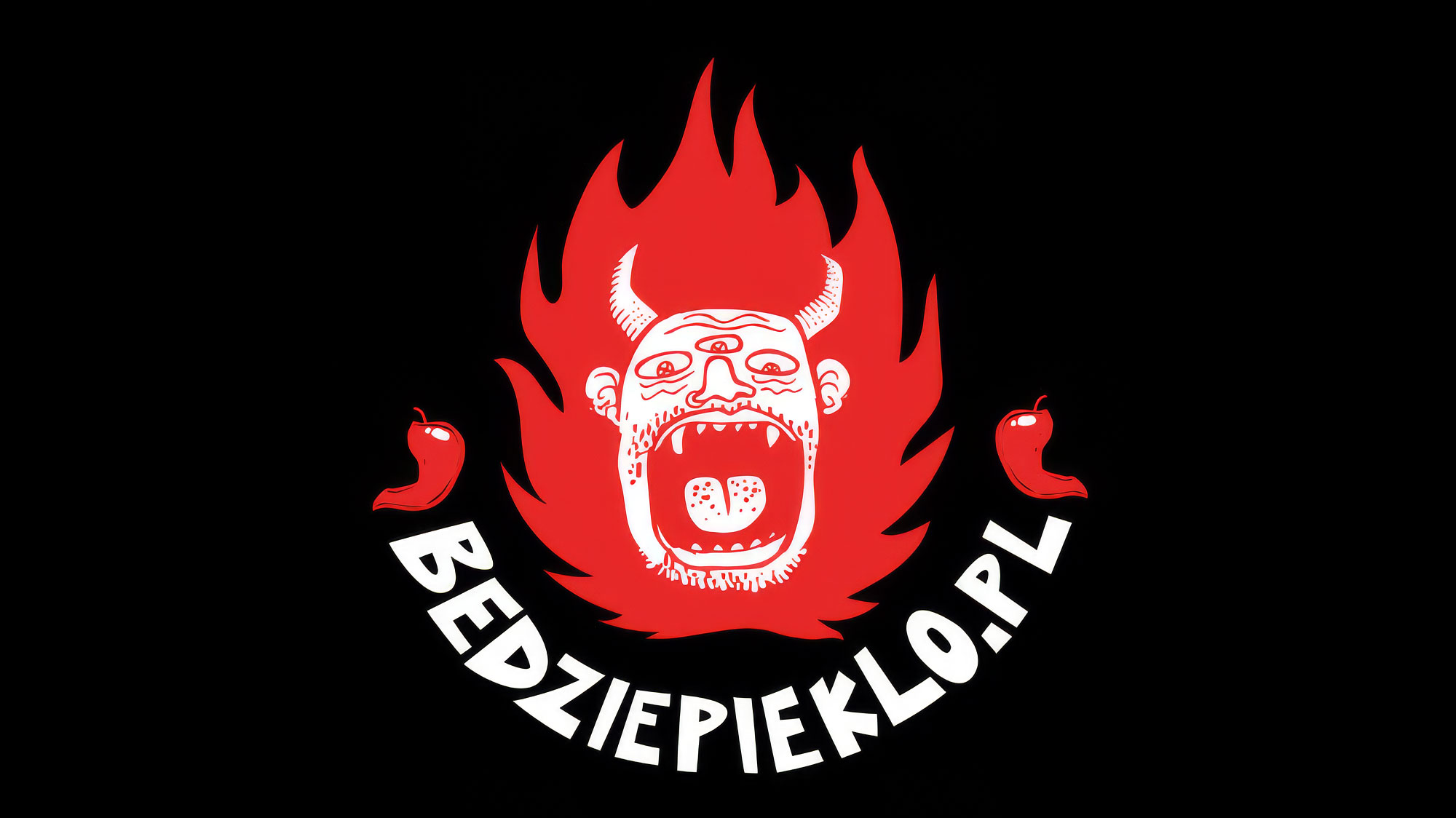
Będzie Piekło was a fantastic project to be on. It brought together two of my dear favourites: gastronomy and illustration. The logo(s) were, in fact, hand-drawn, as was the logotype.

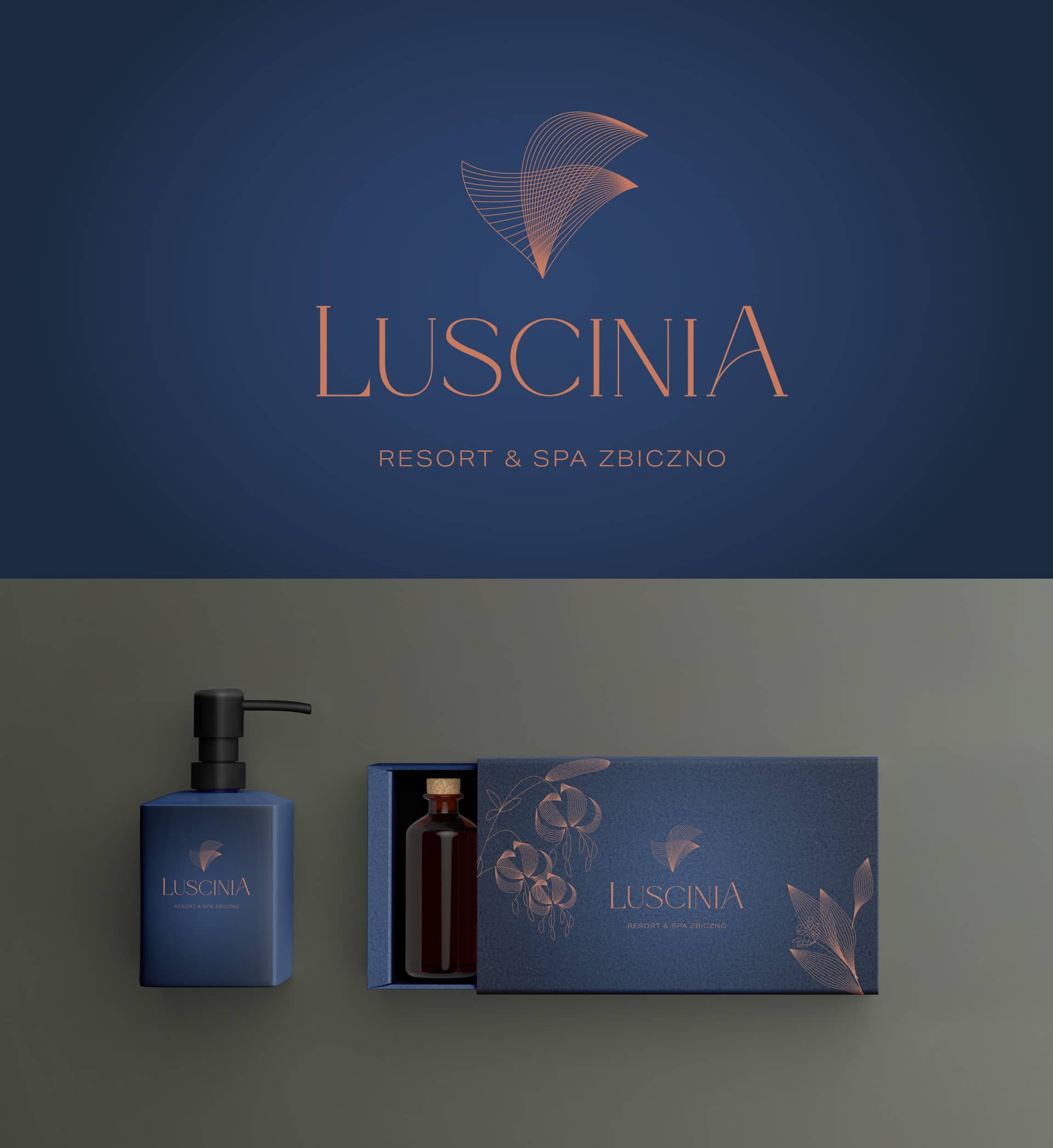
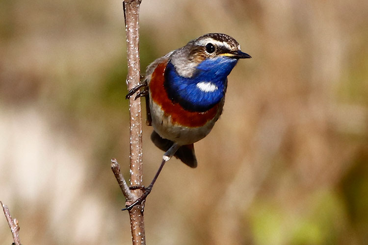
A beautiful project in an idyllic location. Zbiczno, Poland's wild conifer forests, is home to the "Luscinia," or Nightingale, from which we draw the soothing beauty for the resort & spa. The focus was to be one with the nature around.

I’ll start by finding what you stand for, then build how you show it. Clear convictions first, visibility second, and we’ll measure it by the enquiries you get and whether people repeat your message back to you.

info@concretetiger.com +351 929 410 421